This article originally appeared in the June 2011 issue of Professional Surveyor magazine.
Part 1
The issue of CAD standards has long been one of my pet projects when working with clients. It’s the universal problem, as folks from every office confess that CAD standardization is either “non-existent” or, at least, “could be better.”
In my experience, the single most-intimidating aspect to developing a CAD standard is deciding how to standardize annotation in order to accommodate the multiple scale factors used in a typical plan set. Other types of sheets surveyors and civil engineers may have to produce are:
- a cover sheet (at 1:1 or no scale),
- one or more project or phase site plan sheet (at 1:50, 1:100, 1:500, 1:1000, etc.),
- plan and profile sheets (at 1:30, 1:50, etc.), and
- detail sheets (at 1:1 or no scale).
It’s not an easy issue to resolve, and CAD programs seem to vary from bad to worse in their ability to manage multiple scales within a single CAD file.
Some of the information provided here is very basic, but in my experience even long-time CAD users struggle a bit with the “under-the-hood” details about annotation sizing. So, that being said, where should you start?
Determine the Plotted Size, Plotted Height, Plotted Distance … of Everything
The most important first step when developing a CAD standard for annotation is to determine the desired plotted size of annotation entities. And, when we discuss annotation, we must remember that this encompasses more than just text; it also means linetype patterns and dimension styles.
Here are several sample questions to ask when developing a CAD standard for annotation:
- When plotted, what is the height (in inches) of the text displaying:
– the project title in the title block?
– the road name?
– contour labels?
–
property line bearings and distances?
- When plotted, how far off the property line (in inches) should the bearing and distance label be placed?
- When plotted, what is the distance (in inches) between labels along a contour?
- When plotted, what is the length (in inches) of the arrowheads at the end of dimension objects?
- When plotted, what is the distance (in inches) that the extension line extends beyond the dimension line?
- When plotted, what is the length (in inches) of the dashes and gaps in the linetype used to show existing contours?
Overwhelmed yet? Don’t be. Once you commit to the size or height of a few entities, the rest come fairly easily just because you know that you want one entity a little smaller or a little bigger than another.
The remainder of this column covers the issue of standardizing text sizes in your CAD files. Future columns will cover the other questions relating to linetypes and dimension styles in much more detail.
Standardizing Text Sizes and Placement
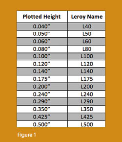 Although text height can be set to any desired value, the most commonly used height for plotted text in civil/survey drawings is 0.08”. There are several other standard text styles (corresponding to the height of the plotted text), known as “Leroy,” that have been adopted from the days of hand and technical lettering. Even though the “Leroy” text style usually has a Simplex font, the naming convention is widely accepted to describe text of a specific height regardless of its font. For instance, L80 text refers to a Leroy style text that plots 0.08” high; L100 is Leroy with a plot height of 0.10”; and L200 is Leroy with a plot height of 0.20”. Other standard heights and style names are shown in figure 1.
L80, or text that plots 0.08” high, is generally used for basic text such as bearings and distances, contour labels, and notes. For more prominent text such as road names or parcel numbers an L150, or text plotting 0.15”, may be used.
You may be saying, “Yeah, that’s great and all, but when I enter text it asks me for the height of the text to be placed in the drawing, not its plotted height.” If you use the generic commands for placing text, that is true. However, most civil/survey programs have specialized commands for labeling that also take into account a horizontal scale that you specify independently for each drawing.
For instance, in Carlson Software or Civil 3D, you can specify program defaults so that bearing and distance labels always have a plotted height of 0.08”. Then, as each new drawing is started, you set its horizontal scale. For a drawing with a horizontal scale set to 1”=50’, the bearing and distance labels will be placed in the drawing at a height of 4.0’ (0.08 x 50 = 4.0). For a drawing with a horizontal scale set to 1”=100’, the bearing and distance labels will be placed in the drawing at a height of 8.0’ (0.08 x 100 = 8.0). The plotted height never changes.
Consider what a written standard for annotation would look like if we did not base the standard on the plotted size but on the actual drawing size of text…
- In all 50-scale drawings, bearing and distance labels shall be placed in the drawing at 4.0’ high.
- In all 100-scale drawings, bearing and distance labels shall be placed in the drawing 8.0’ high.
- In all 50-scale drawings, all property corner labels shall be placed in the drawing 3.0’ high.
- In all 100-scale drawings, all property corner labels shall be placed in the drawing 6.0’ high.
- Unless otherwise specified, all other text in a 50-scale drawing shall be placed in the drawing 4.0’ high.
- Unless otherwise specified, all other text in a 100-scale drawing shall be placed in the drawing 8.0’ high.
Now, with the understanding that all annotation sizes must be scaled by the horizontal scale, we can simply say:
- All road names shall be L150.
- All property corner labels shall be L60.
- Unless otherwise specified, all other text shall be L80.
As you can see, because the text sizes refer to a plotted height, it makes the writing of CAD standards for annotation remarkably easier.
 It is also important to note that, when placing text in a drawing, parameters other than text height can be adjusted to get the desired look. One of these
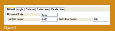
parameters is the distance a label is placed above or below the line it labels. Figure 2 shows a clip of the Annotate Defaults dialog box in Carlson Survey 2011.
It is also important to note that, when placing text in a drawing, parameters other than text height can be adjusted to get the desired look. One of these
parameters is the distance a label is placed above or below the line it labels. Figure 2 shows a clip of the Annotate Defaults dialog box in Carlson Survey 2011.
The text height is specified using the “Text Size Scaler” value, and the distance that text is offset from the line it labels is specified by the “Text Offset Scaler.” Both of these values are “plotted” distances in inches. You can also see the horizontal scale setting for the drawing. Once plotted, text placed using these settings will be 0.08” high, and it will be positioned 0.04” off the line. A good rule of thumb is to set the offset value at one half the text height.
Another example of an annotation standard that can be associated with a plotted distance is how far apart to place elevation labels along a contour. Rather than specifying that contour labels are “300’ apart in a 50-scale drawing” or “600’ in a 100-scale drawing,” your standard should state that: On the plotted sheet, contour labels shall be shown at 6” intervals along each index contour.
I hope this information has provided a good kick-start toward your CAD standardization goals and helps get you thinking in plot sizes rather than drawing sizes. As noted above, future columns will focus on other supposed standardization nightmares such as dimension styles and will also touch on some specifics of the different CAD programs. Please don’t hesitate to contact me if you have questions. I hope your summer is off to a great start!
This article originally appeared in the June 2011 issue of Professional Surveyor magazine.


